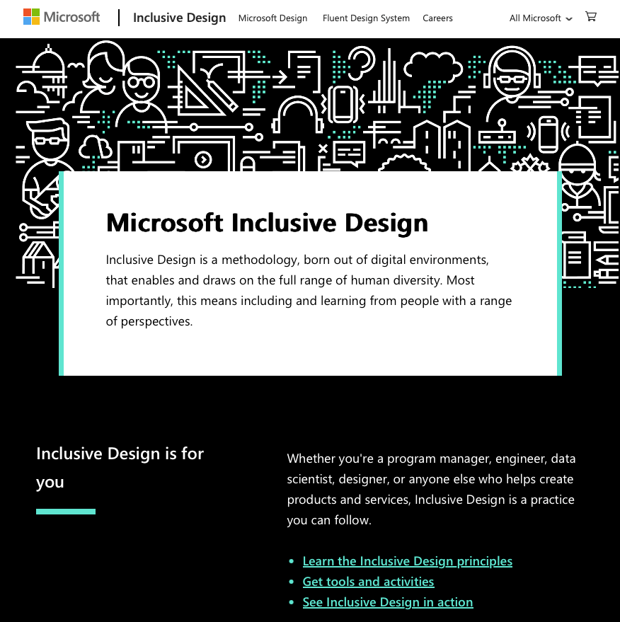
A Review of Microsoft’s Inclusive Design Site
In today’s rapidly evolving digital landscape, the importance of inclusive design cannot be overstated. Companies like Microsoft are at the forefront of this movement, creating tools and guidelines that empower others to embrace inclusivity. Microsoft’s Inclusive Design site—found at inclusive.microsoft.design—serves as a comprehensive resource for anyone looking to understand and implement inclusive practices in their work. As someone deeply invested in inclusive design, strength-based messaging, and trauma-informed marketing, I find Microsoft’s approach both commendable and inspiring.
The Core Principles of Inclusive Design
Microsoft’s Inclusive Design site is built around three core principles:
- Recognize Exclusion: The site emphasizes that exclusion occurs when we solve problems using our biases. By recognizing exclusion, designers can begin to understand and address the diverse needs of all users.
- Learn from Diversity: Microsoft encourages learning from the full range of human diversity, encompassing a wide variety of abilities, age groups, genders, and backgrounds. This principle resonates deeply with the idea of strength-based messaging, which focuses on the unique strengths of diverse individuals.
- Solve for One, Extend to Many: The concept of “solve for one, extend to many” is about designing for individuals with specific needs, which often results in solutions that benefit a broader audience. This principle is closely aligned with trauma-informed practices, as it seeks to create environments that are safe, welcoming, and accessible to everyone.
Site Structure and User Experience
The site is thoughtfully structured, making it easy to navigate whether you are a seasoned professional or new to inclusive design. The homepage is clean and minimalistic, guiding users through the core principles with succinct explanations and visual aids.
One of the standout features is the Toolkit section, which provides practical resources such as activity cards and persona spectrums. These tools are invaluable for teams looking to incorporate inclusive design into their processes. The activity cards, in particular, are a creative way to engage teams in brainstorming sessions that prioritize inclusivity from the outset.
Another key feature is the Case Studies section, which offers real-world examples of how inclusive design principles have been applied across various projects. These case studies not only demonstrate the impact of inclusive design but also provide a blueprint for others to follow.
Strength-Based Messaging and Empathy-Driven Storytelling
The site does an excellent job of integrating strength-based messaging and empathy-driven storytelling. Each case study and resource is presented in a way that highlights the strengths of diverse user groups rather than focusing on deficits or challenges. This approach not only empowers users but also fosters a deeper connection between the product and its audience.
Microsoft’s focus on empathy is evident throughout the site. The language used is accessible and welcoming, avoiding technical jargon that might alienate some users. This commitment to empathy extends to the design of the site itself, which is intuitive and user-friendly, catering to individuals with varying levels of digital literacy.
Culturally Competent Campaigns and Ethical Considerations
While the site excels in many areas, there is room for further exploration of culturally competent campaigns. The principles of inclusive design naturally lend themselves to cultural competence, but more explicit guidance on how to navigate cultural sensitivities would be a welcome addition. This could involve more in-depth discussions on how to design for global audiences or how to incorporate cultural intelligence into the design process.
In terms of ethical considerations, the site is grounded in the ethos of creating technology that benefits all users. However, as with any design philosophy, there is a need for ongoing reflection and dialogue to ensure that inclusivity does not become a buzzword stripped of its deeper meaning.
Conclusion
Microsoft’s Inclusive Design site is a powerful tool for anyone committed to making technology more accessible and inclusive. It provides a solid foundation for understanding and implementing inclusive design principles, while also offering practical tools to put these principles into action. For those of us who are passionate about strength-based messaging, trauma-informed marketing, and culturally competent campaigns, this site is a treasure trove of insights and resources.
As the digital world continues to evolve, the importance of inclusive design will only grow. Microsoft’s commitment to this cause is evident throughout their Inclusive Design site, making it a valuable resource for designers, marketers, and anyone interested in creating a more inclusive future.
By reviewing Microsoft’s Inclusive Design site, we not only gain a deeper understanding of how to make our work more accessible, but we also reinforce the idea that inclusivity is not just a trend—it’s a fundamental shift in how we approach design and communication. This site is a must-visit for anyone looking to stay ahead of the curve in today’s inclusive-driven market.